
Figma, Adobe Illustrator, Adobe Photoshop, Adobe Premiere Pro, Adobe After Effects
My work at YASC includes, 3 UI Designs for 3 different in house systems, 3 brochure designs to be used for exhibitions, an exhibition booth design and video editing for social media.
Overall, I learnt a lot of different skills and got to apply the knowledge I gained in school to real world projects. Having the opportunity to explore and try different things , such as brochure design and booth design has widened and sharpened my design skills.
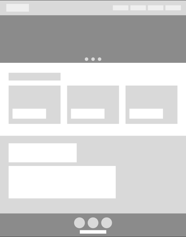
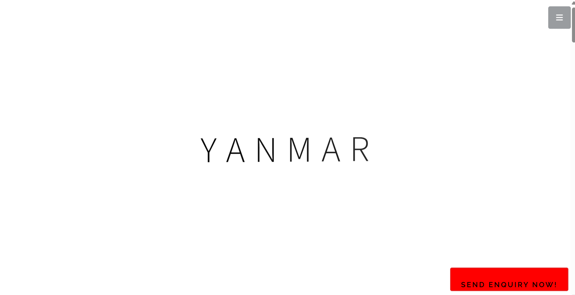
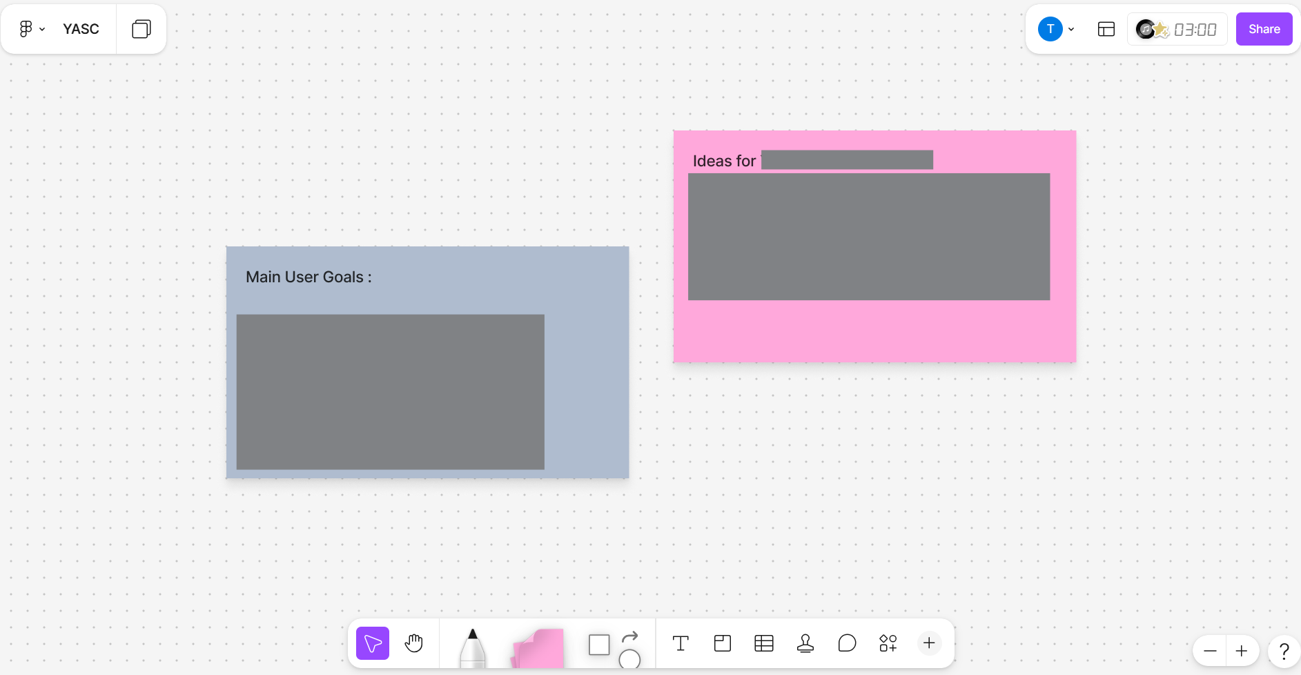
My very first work at YASC was a UI Design for an in house system. I started my design process by doing a lot of research, as YASC is in the industrial sector which I am unfamiliar with. The research done was mainly comparison of existing Yanmar websites, with competitor websites. Additionally, I communicated with my supervisor every time I was unsure about the company's context. After doing research, I compiled all my inspirations and research findings into a word document. I then started brainstorming content and layout on Figma. Another important part is identifying key user goals and processes.
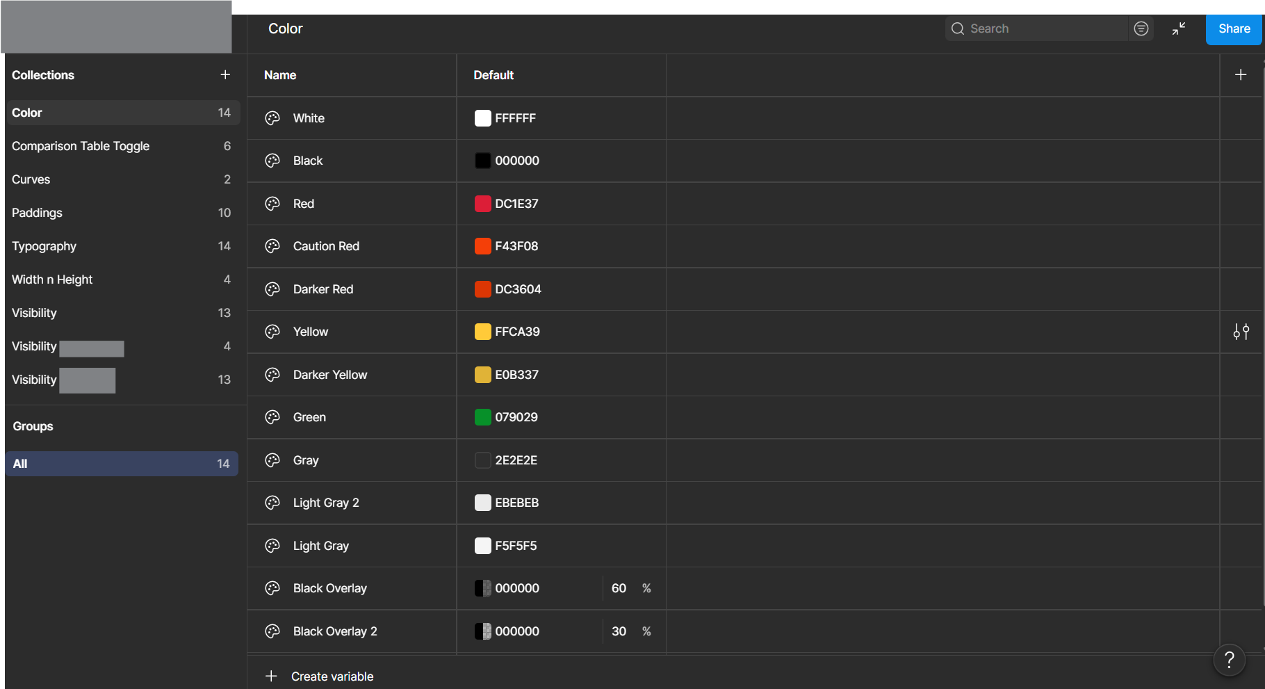
After finalizing a layout with approval from my supervisor, I started on creating a mockup, mainly using AI to create images as there were not many images readily available I could use on the website. I decided on a color palette and followed the brand guidelines so that my UI design, aligns with the branding of YASC. I also checked in with my supervisor on my design regularly, this allowed me to add and refine the design further in order to better fit the project brief.
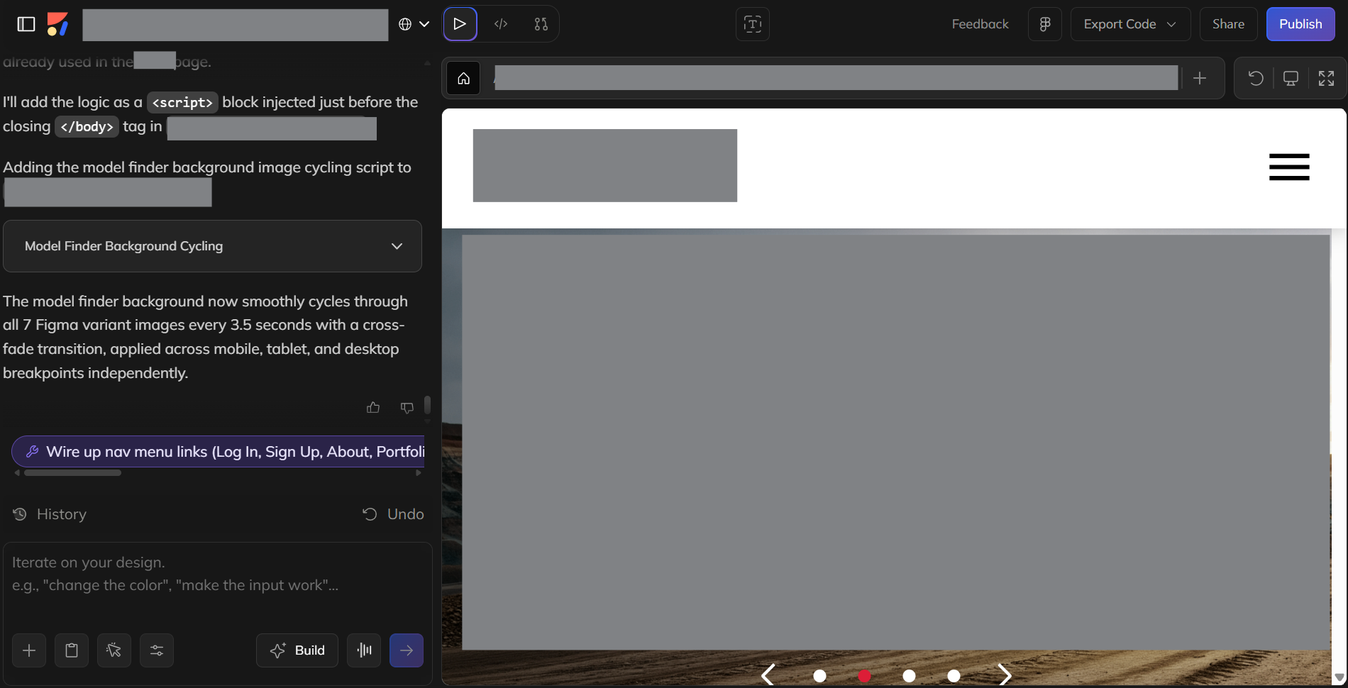
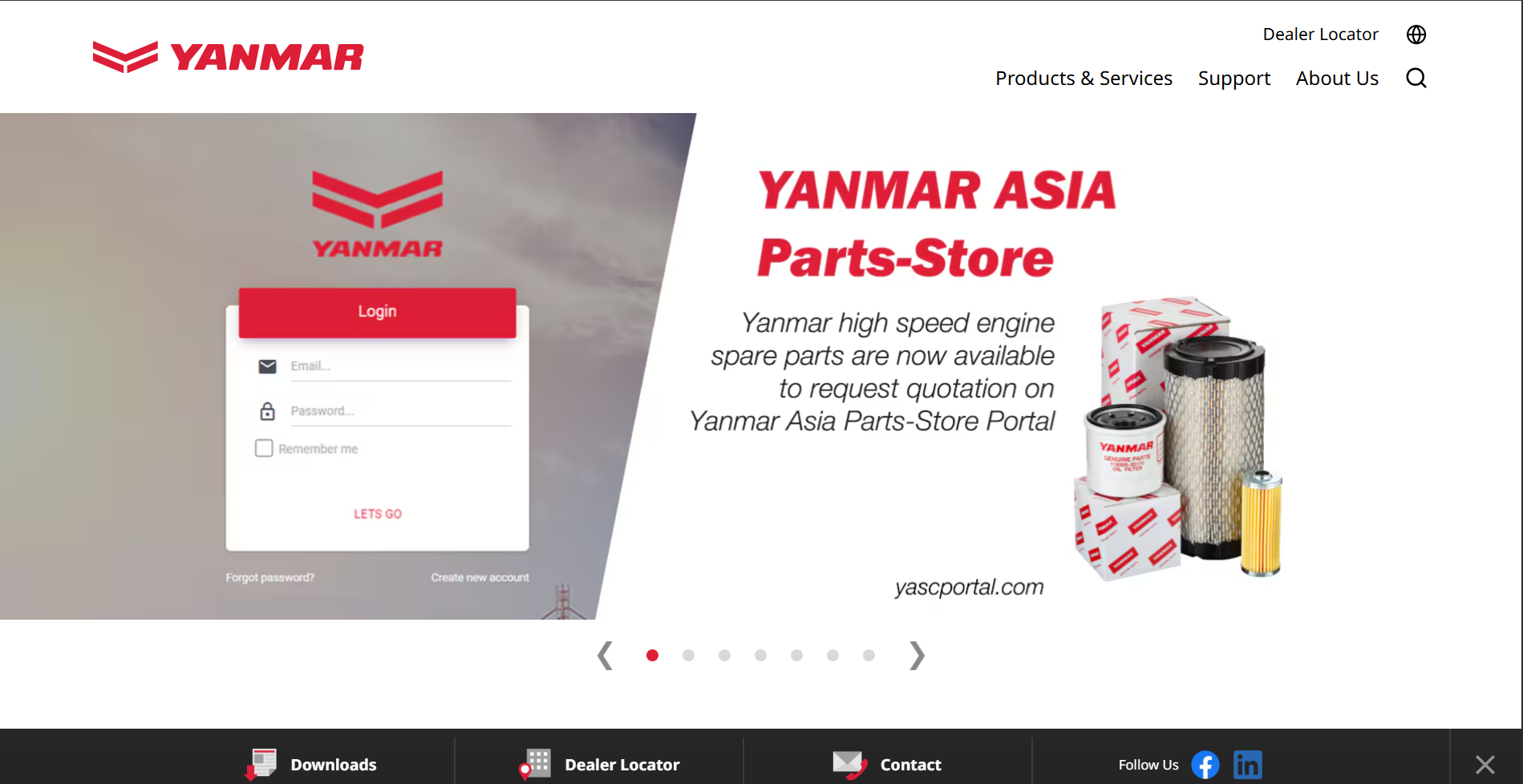
There were also meetings where I would present my design to my supervisor and other colleagues that were involved in the project, where I would gain insights and better refine the UI Design. We also had meetings with the IT team, where I was informed that I would have to provide them with the HTML & CSS code of my website. To do this I had to learn how to use Anima (Figma Plugin) that can help convert my Figma design into code.
I did some research on the plugin and discovered that I had to use some Figma features that I hadn't used before such as auto layout and style libraries, I then recreated my design for desktop, tablet and mobile views using auto layout and style libraries.
I then used Anima and converted my design to code, however I also had to manually adjust the code as some elements were not working as intended. I did this with the help of AI.
The 2nd UI Design being done was a rework of an existing website. Aside from redesigning the existing pages, I also needed to brainstorm different ways this website can bring more value to the users, this included adding additional functions and additional pages. I mainly did research through looking at the existing websites, listing the different tasks users can do on that existing website and brainstorming new tasks or features that can be helpful to the users.
I then started brainstorming different design layouts that can be used so that the website will look more consistent with Yanmar's branding.
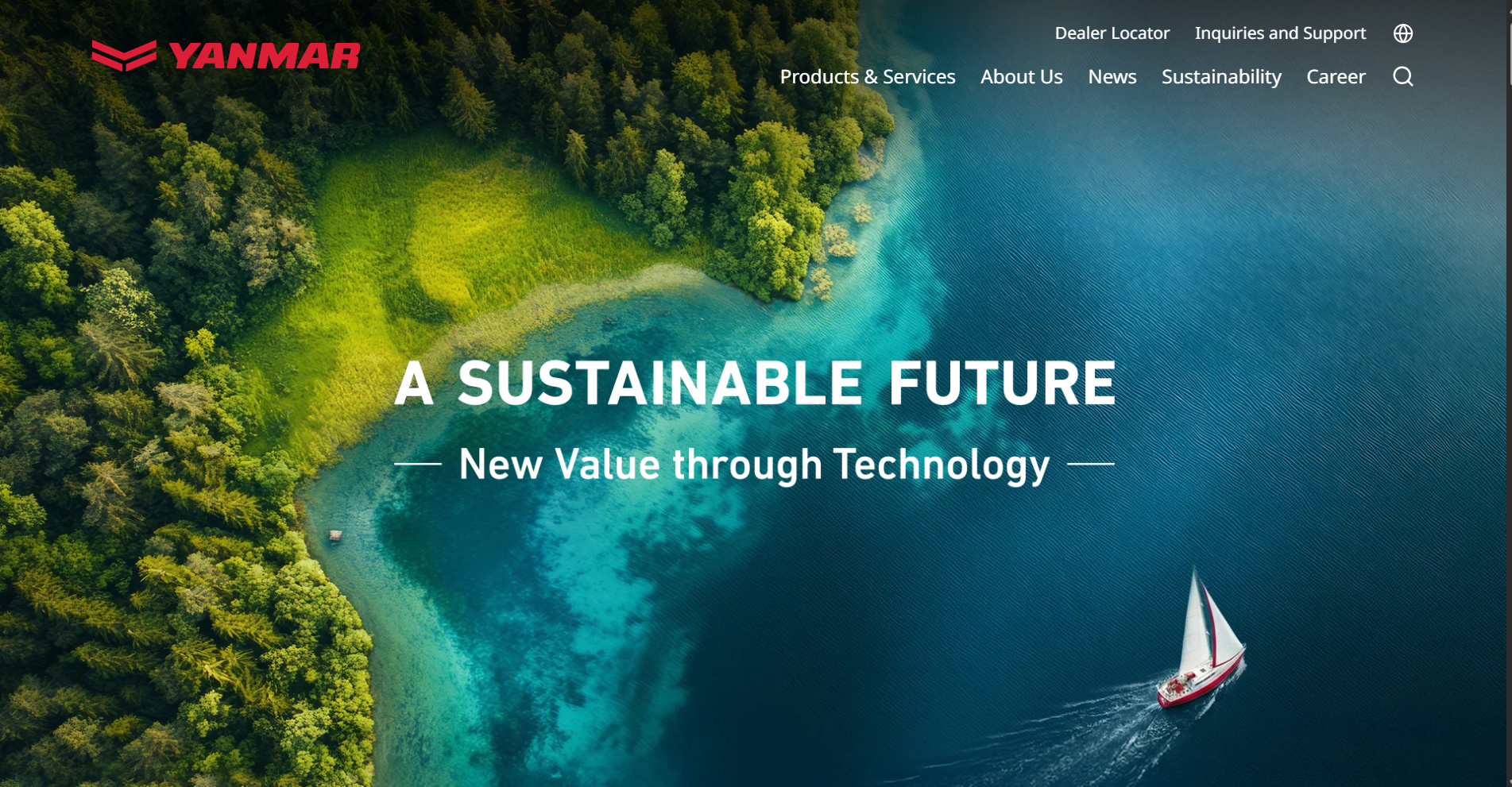
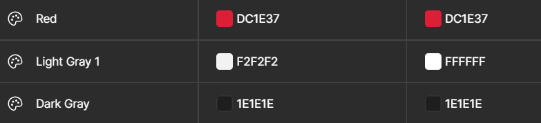
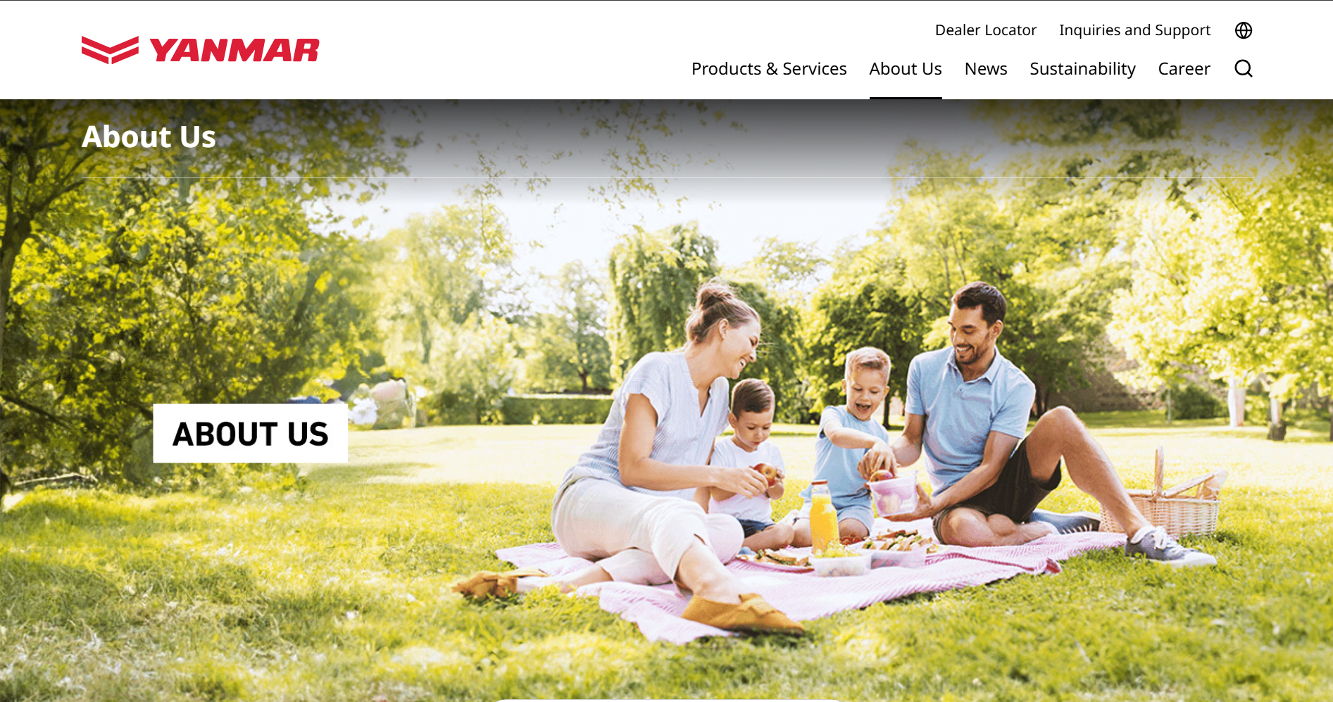
After finalizing a layout, I started creating my mockup and prototype. For this project, I had to learn more advanced prototyping so that I can show my vision to my supervisor. I also had to make sure that the design followed Yanmar's brand guidelines such as proper color palette (red, white, light gray, gray). To do this I took a lot of inspiration from the Yanmar Global website, such as for the headers and other website elements.
I wanted the website to be more visually engaging and more useful. To do this I had to think out of the box and incorporate more visuals. More functions were also added to the website to make it more useful.
Overall this project gave me the creative freedom to explore different layouts and improved my Figma skills in prototyping, allowing me to bring more of my ideas to life.
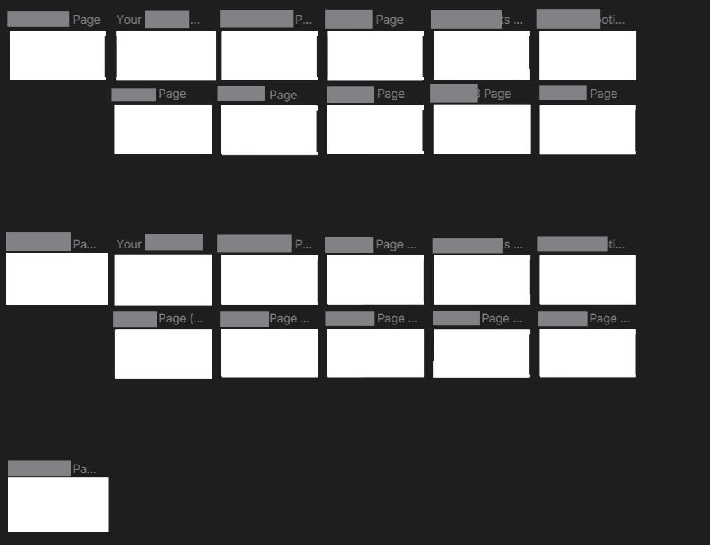
The 3rd UI Design was the most challenging one as it was designing a system that has many different functions entirely from scratch. This required more in depth knowledge and more complex task flows. This project required there to be different users that have different functions and different visibility.
To start, I brainstormed and listed down what functions are needed in each user's UI. I then explored how the different functions can connect to each other, and tried out different layouts on Figma. I also worked closely with another intern, who was in charge of developing the system and clarified anything that I was unsure about.
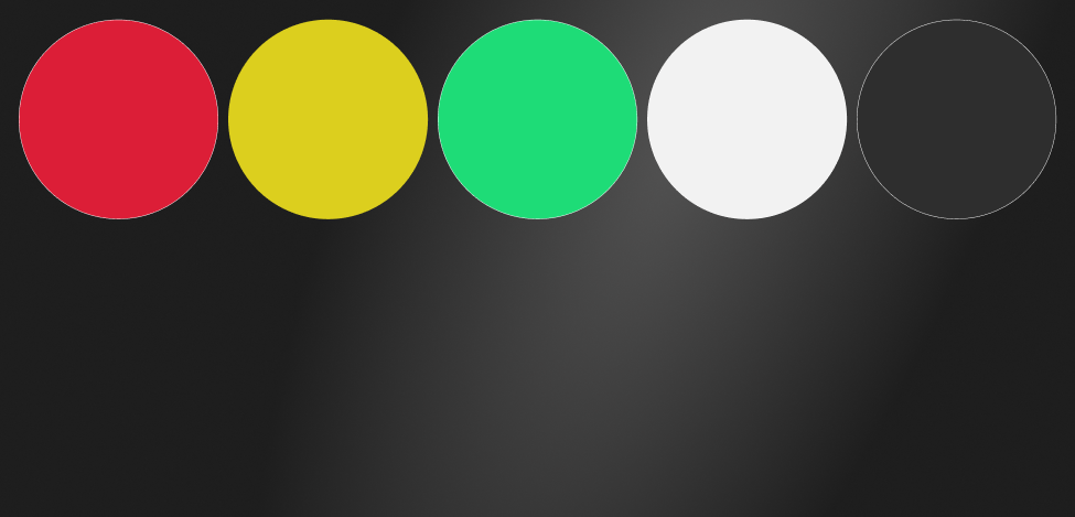
I then tried different layouts and decided on a final one with approval from my supervisor. The layout was challenging as this UI design was not a traditional website design. I then decided on a color palette mainly utilizing dark gray and metallic backgrounds to give the design a more high tech feel.
I then started building each page, and then finished with the prototyping of the end user's UI. After the end user's UI I started on the other 2 users UI, while designing I had weekly meetings with other colleagues involved in this project, and constantly refined my design through their feedback.
This project allowed me to explore a lot of user flows and how different users may interact with a digital product.
The 1st brochure i designed was a 3 fold a4 brochure. This was the first brochure I have ever made. To start, I looked at existing Yanmar brochures and the previous brochure drafts, I also looked at other brochures online for inspiration.
I then decided on a color palette to use, which was red, dark gray and whites, to match Yanmar's brand. I planned where each content would be on the brochure and started trying out different layouts
After deciding on a layout, I looked through pictures and edited them to use on the brochure. I then added the text and images, and played around with the layout to ensure a smooth text hierarchy. I made the text more concise and used as many pictures as possible to ensure the brochure remains visually engaging. After I was done with the design, I checked back with my supervisor and refined the design with her feedback.
The 2nd brochure I designed was a product brochure that was a 2 fold A5 brochure. This brochure had previous designs, ideation mainly came from the previous designs where I identified elements I liked from the 2 designs and improving and adding it into the current brochure design.
For this brochure, I had to organize technical details into concise and easy to digest formats, I had to ensure that there was a good balance of visual elements and text content.
Overall designing this brochure was a smoother process than the first one and is one of my favorite brochure design as the final design turned out better than I expected. I got to try out different layouts and styles before deciding on the final design.
The 3rd brochure I designed, did not have any previous brochure design. The information was also quite lacking, therefore most of the research and brainstorming was to find a good way to advertise it and different content to fill up the page. The brochure was an A4 double sided brochure.
I wanted the cover page to have a minimal and sleek design to match other product brochures. Using colors such as gray, white and red. The next page, I brainstormed different content ideas based on the limited information found on the website. After being satisfied with the layout and content, I checked with my supervisor before finalizing the design.
This was the first booth backdrop design I did, firstly I researched on how to set up the file on illustrator, and brainstormed which content would go on which wall. There were 2 walls one of which was 6m x 4m and the other wall was 3m x 2.5m. I decided to display the new Mission Vision and Values on the smaller wall, and have a small section showing engine details on the bigger wall, with majority of the space focusing on content about the Indonesian Yanmar dealer, PT Pioneer.
I decided to start with the smaller wall. While designing the backdrop, I wanted to prioritize interesting graphics and images, instead of relying mostly on text to relay information, to do this I had to do a lot of trial and error with different graphic and image layout ideas.
For the larger wall, I took reference to the previous design for the engine section and decided on using a big map of Indonesia as the main graphic for the distributor section, showing the different locations they have.
Built with Journo Portfolio